RMWHITE CPA
︎︎︎
RMWhite CPA is a family accounting and tax advisory firm specializing in emerging business services
VISUAL IDENTITY DESIGN -
2019
They requested a logo and appearance that was approachable and friendly but also strong and commited. The symbol of a duck means something to them as a family (ducks are gregarious = they stick together / rely on each other, they navigate both the sky and the water = intelligence-versatility-freedom) These same values are indicative of their family and applied throughout their practice.


GUIDELINE SHEETS, VERTICAL MONOGRAM + LOGOTYPE
It was necessary for the monogram to fit together seamlessly creating a duck silhouette while keeping the letters recognizable to anyone.
After working with RMW to define a color scheme that would work for the brand, I planned out some custom assets that made sense for their team’s needs.
After working with RMW to define a color scheme that would work for the brand, I planned out some custom assets that made sense for their team’s needs.
- Icons for web and social media
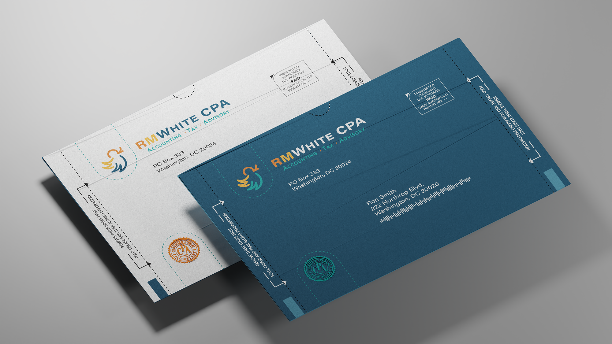
- Mailer
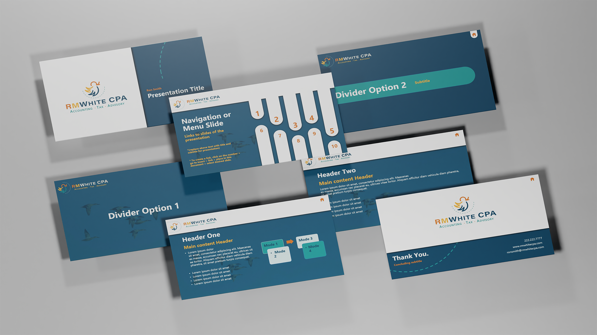
- PowerPoint deck with interactions
- A how to guide to use the deck - business cards
- Brief brand guideline about what typefaces, displays and point sizes needed to be used in tandem with brand assets and colors.


Stationary Mockups made from 3D renders: Pens, Mailers, Business Cards, Notepad, Deck